When I was a kid, I was an artist. Whether or not I was good, that’s what I was. I spent my 20s, which were the 2000s, doing album covers and band or theater company posters. It was rad, but it never really took off. Growing up felt like it ground the artist out of me.
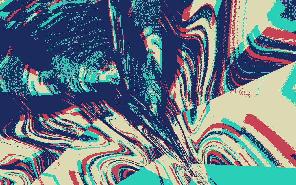
When my brother died a few years ago, I felt bad the way you do when part of your foundation cracks. The whole world was a little different, and I liked it a little less. After a few months of being kinda terrible to be around, I started exploring little tools people made to create weird, dithered, brightly colored art chunks. At first, my taste/judgey-art-school student kicked in: “You’re pretty bad at this, and no one cares if you do it.” And that voice was technically correct, I was bad at it and no one cared. But it gave me time to just be and explore these wild explosions of color, and the more I let myself enjoy it, the happier I was. Maybe I would’ve rolled that darkness out of it without diddling myself with pixels, but I’m genuinely happy I did.
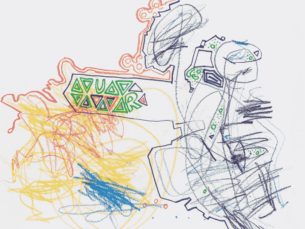
The lesson of “I like this and I don’t care how good I am at it, so I’m going to keep doing it” didn’t just pull me out of that part of my life, though; it also reared its head again with my kid. Something I’ll do with her is draw, sometimes separately but also together. She’ll draw a thing, and I’ll draw around it, or I’ll draw a thing and she’ll run through it like a train. Sometimes it’s a disaster, but sometimes it’s genuinely delightful or striking.
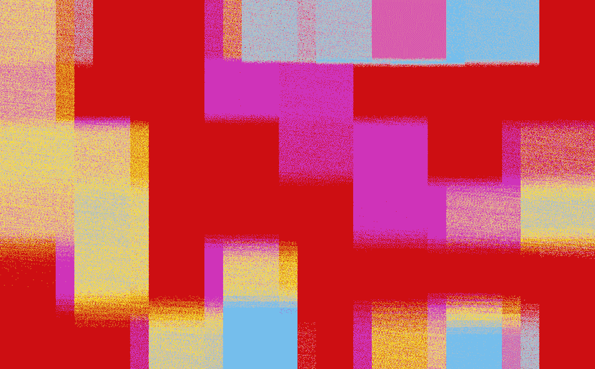
Here’s the thing about most kids’ art, whether it’s crayons or markers or colored pencils, it’s usually like 2, 3, or 10 colors. Well, that’s not a bad place to start with a Risograph print, a screen print, or a low-color PNG for a website.
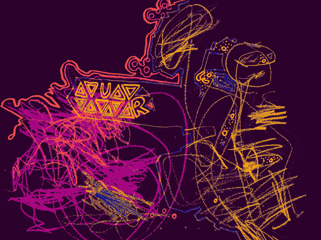
I think this way of thinking about a picture as layers of color isn’t like the pinnacle of creation, but it’s a really interesting set of constraints that can push you in cool directions. So I made this very rough tool for adjusting the colors of an image with a few colors, color layers.
There’s a tiny accessibility angle: if you want to work on a design and use it as a background image with text over it, it has an easy link off to colors.fyi’s contrast checker with all the colors in your image.
Anyway, I hope you dig it.
Links to other tools I’ve used and love
- repper
- Snorpey’s experiments
- Photomosh
- Triangle art
- Inkscape
- Robarf (full disclosure that’s mine)